Ticket Analytics Dashboard
Helping admins understand internal ticket use

Overview
Team: User Experience Designer, UI Designer, Front-End Developer, Two Product Managers, Two Systems Architects, CTO, & COO
The Analytics Dashboard project goal at TicketManager aimed to create a dashboard to quickly educate users on the event ticket assets (Sports, Concerts, etc) that they track in the TicketManager system.
Our overall hypotheses: A dashboard on the homepage showing “Ticket Use” and “Tickets with $0 Face Value” will help system administrators keep track of their ticket usage and improve ticket data quality.
User Personas & Problems
The primary persona we focused on for this project was that of one of our System Administrators. Administrators upload ticket inventory, manage email invitations, and often manage their own Client Entertainment or Marketing team. They typically partner with multiple event agencies, venues, and sports teams to procure thousands of ticket assets and are responsible for the distribution. Often, it is up to this person to determine the success of a particular event and whether or not to continue investing in similar events or to look elsewhere. They answer to executives and need a quick, usable, and at-a-glance way to see the effectiveness of their assets.
Problem #1: Administrators often reported having difficulty keeping track of the overall ticket usage in the system. Internal employees would frequently request tickets in the hundreds or thousands. The existing solution offered a table view of all events, number of tickets per event, and number of requests and invitees per event. There was no design or experience to that revealed the entire system status of tickets.
Problem #2: The quality of data suffered during the initial upload process. Face Value was an important metric for keeping track of the return on investment (ROI) of a ticket asset. If a ticket had $0 in the Face Value field, it was difficult for administrators and executives to calculate an events ROI. Design improvements were being made to the initial upload process, but the team felt introducing a chart tracking “$0 Face Value Tickets” would increase awareness of poor data quality.
MVP
We initially shared clickable prototypes and designs internally to employees who aren’t as familiar with our product, as well as externally to customers who have mentioned interest in deeper insights into their ticket usage. Some of what we learned is that users found the old dashboard useful as an overview of their assets in the system, however our system redesign did not prioritize a redesign of this component. Education was also important. We were introducing a new element to the UI, which can be a big change for users and can often cause confusion. We found tutorial tool-tips to be a good approach to educate users on the introduction of the new feature.
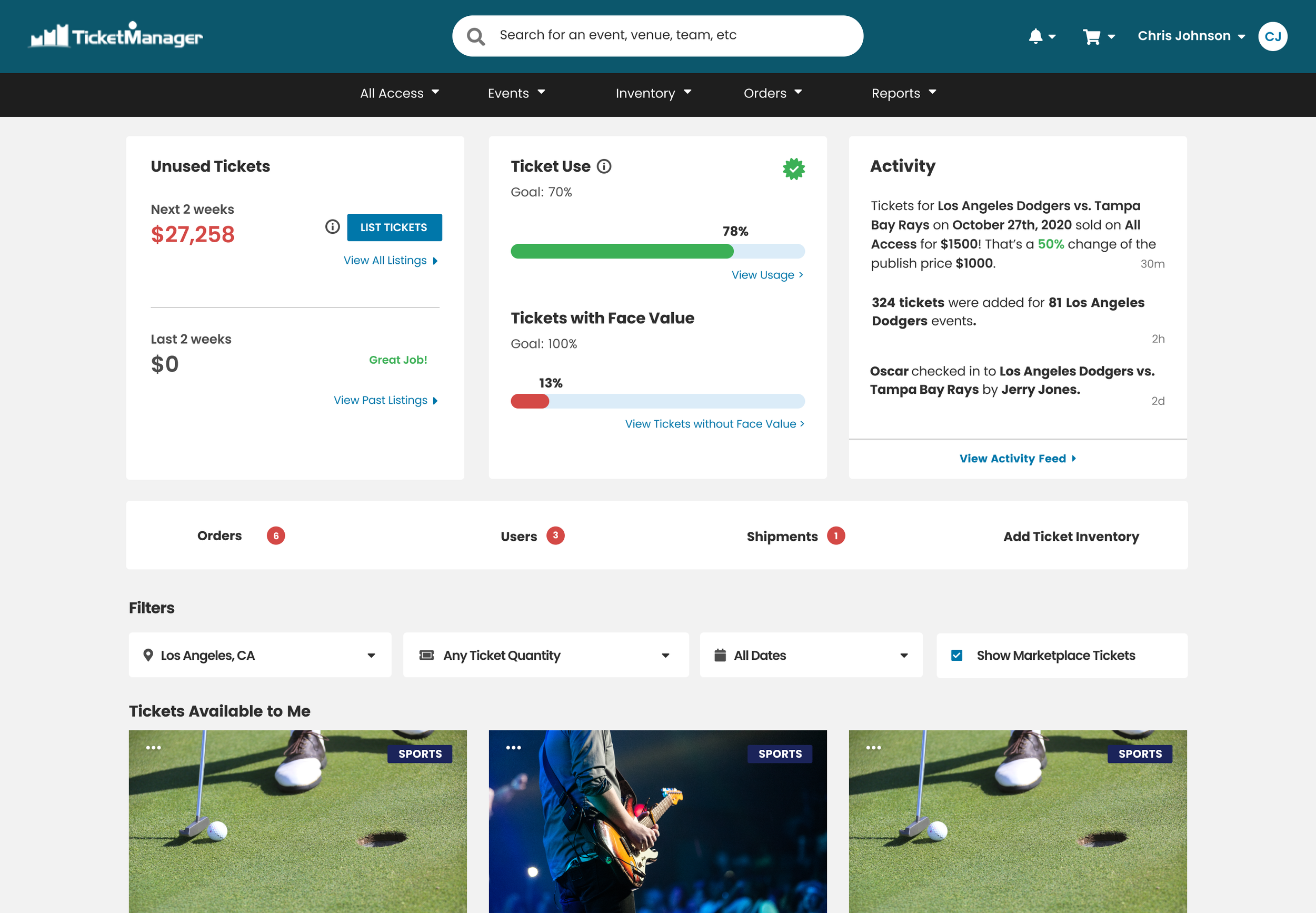
Pictured Below (from left to right): Implementation of the Old Dashboard, Create Your Own Dashboard Concept, Final Implemented Version of Ticket Analytics Dashboard

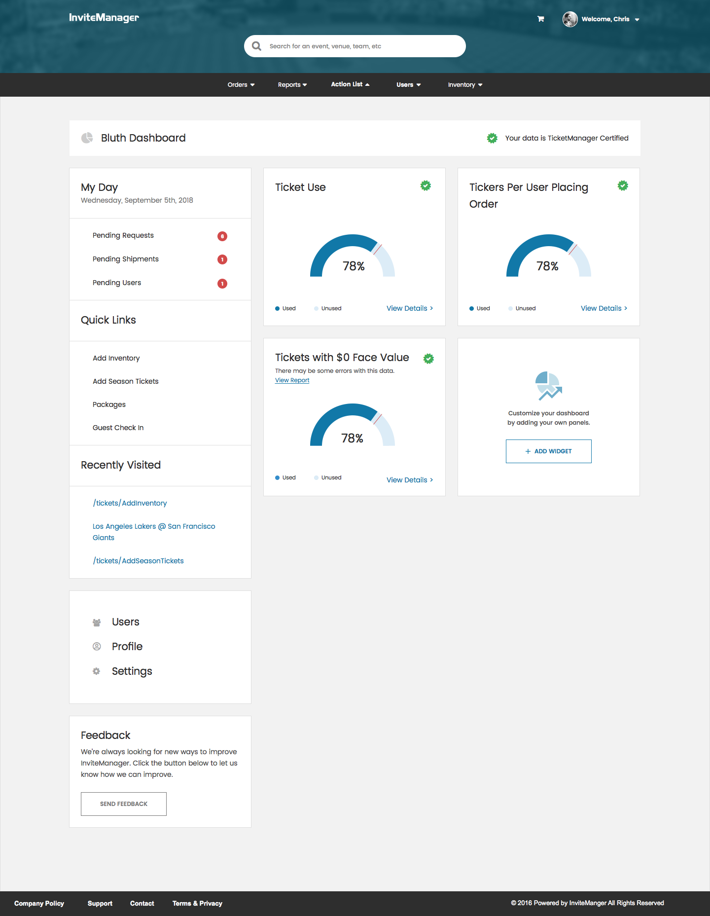

Version 1.0 - MVP


Version 2.0 - Improved Visualizations with Activity Feed
After 6-months of production, we learned quite a few things about our initial hypotheses. First, we learned that overall, the higher level view of ticket transactions are helpful within the system. Second, we learned that our initial design decisions of using a radar gauge to track, made it difficult to attach visual meaning to Ticket Use and Ticket with Face Value statuses. With this in mind, we redesigned the gauges to a more standard progress bar, as well as introduced a new “Activity” box with a rolling feed of specific transactions within the system.