Project: HACKED, The Story of a Data Breach
Authors: Chris Ferenci (Master of Information Management and Systems, ‘23), Michael Yang (Master of Information Management and System, ‘23), Zach Van Hyfte (Master of Science, EECS ‘23)
Link to Project Website: https://chris-ferenci.github.io/Hacked/
Full Report: Click to View Full PDF Report

Background
Over the past two decades, the growth of information technology has been followed by an increase in data breaches. Given the sheer size and variety of organizations targeted by, methods used in, and data stolen from these breaches, it is difficult to grasp the magnitude and severity of this concerning trend. In a 2017 Pew Research survey, two-thirds of Americans reported having experienced some form of data theft, yet the vast majority of them have not adopted strong security practices in their digital lives. The public understanding for data breaches has not kept pace with the increasing severity of data breaches.
Project Objectives
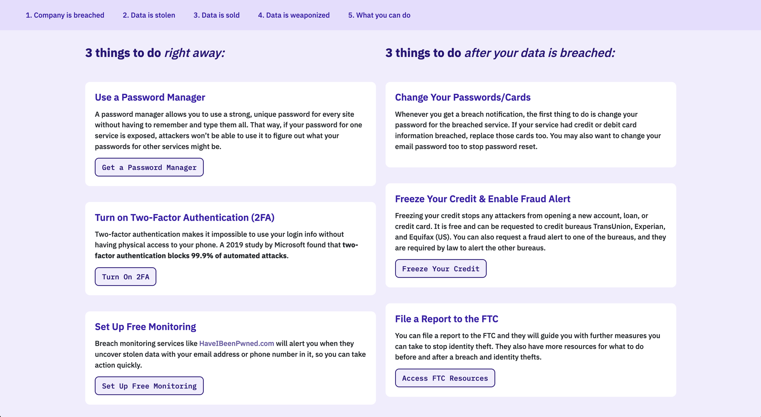
“Hacked: The Story of a Typical Data Breach and Its Consequences” is a narrative infographic that seeks to help its viewers understand what happens after data breaches occur and how they could affect them. The ultimate goal of the project is to urge the viewers to take preventative measures, such as using a password manager and two-factor authentication.
Usability Testing
Usability testing was conducted with 3 participants navigating the first version of the project website. The overall goal of the usability study was to understand if (1) the content was engaging and (2) the design was easy to navigate as a whole, as measured through surveys and interviews outlined above. More specifically, the study sought to understand the following:
Were the messages clear from the line charts?
Did the participants understand how to interact with the interactive charts?
Did the participants want to take the recommended actions?
Did participants recall key messages from each section?
Participants
Participants were recruited from fellow students at UC Berkeley, as they were part of the target audience demographic of active users of online services who may not think about data breaches and their consequences. Additionally, each participant had a different area of concentration in their program of study–software engineering, data science, and UX research–which ensured that our participants could provide a wide breadth of critical feedback on design usability, data visualization techniques, and technical knowledge.
One potential limitation of this convenience sample of participants is that their relatively young age and high level of technical expertise does not necessarily reflect the background knowledge of other non-technical users, who are also part of our target audience. However, we received expert feedback from their respective domain of expertise.
Research Methods
The testing utilized mixed-methods research, with participants answering both quantitative and qualitative questions about the perceived effectiveness of the design, which were asked both orally and via survey. All testing was conducted virtually on Zoom. Each stage, along with questionnaires, is shown in the Full Report.
Research Results
Overall, the usability study revealed that the website was easy to navigate and the visualizations were easy to understand. However, there were several areas for improvement and suggestions to achieve that.
How effective is the visualization in making users take preventative measures?
One of the purposes of our website is to inspire a call-to-action to viewers to improve their existing data security. Two participants already use protective services, so answers were skewed as they answered “Definitely.”
All of the participants suggested adding links to specific resources in the call-to-action section to elicit action more effectively. For password managers, we plan to add links to 2 or 3 popular options. For two-factor authentication, we plan to suggest the most important services (finance, payment processor, social media) for which to enable 2FA, and also different ways to enable 2FA (e.g. SMS, an authenticator app, or a hardware security key). For breach monitoring services, we included a link, but two participants thought the linked service was not free; we plan to emphasize that it is free. One participant suggested that Google Chrome detects breached passwords; we may also note this.
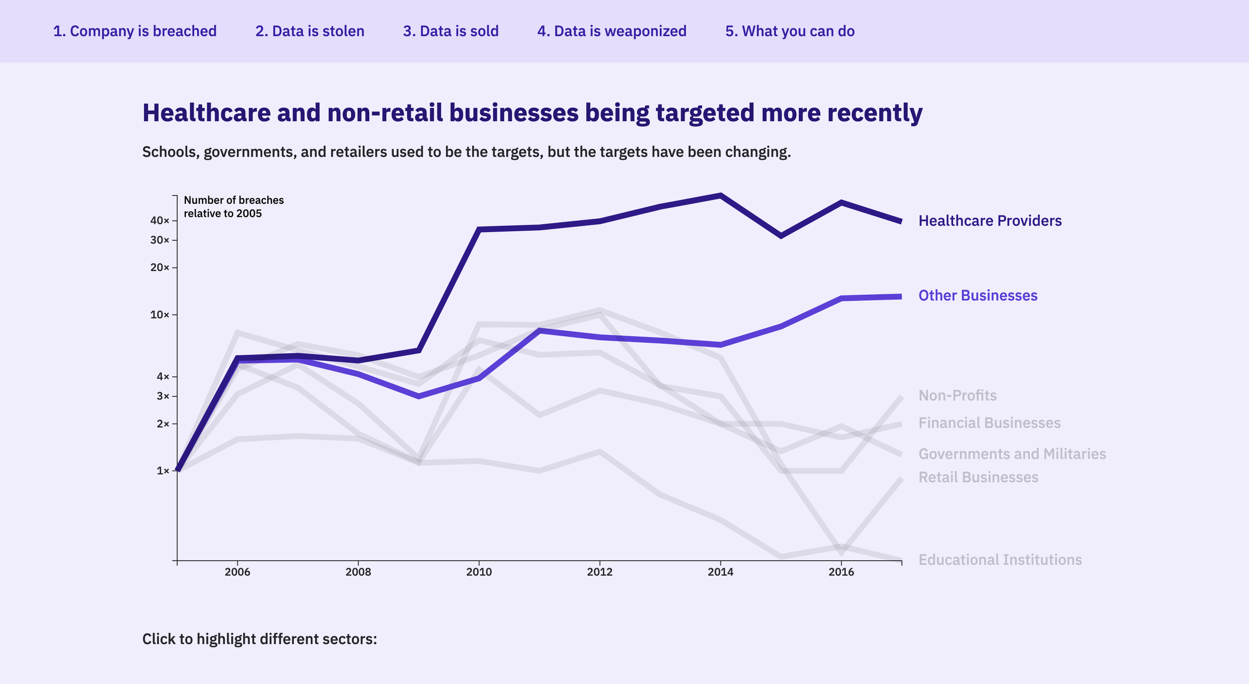
How effective is each chart in communicating the content?
All participants found the side-by-side line charts to be suboptimal. Given the provided text, they understood the key messages (healthcare and other businesses are targeted more, and personal information is being stolen more). Visually, however, they were rendered too big, making it difficult to see them at once. Even if they were rendered smaller, having to compare several charts was difficult. Per their suggestions, we will explore ways to combine and condense the charts into one or two interactive visualizations.
All participants ranked the collapsible tree chart and animated bar charts as their most favorite visualizations, and the reactions we observed from them validate these responses. While they did understand where to click to interact with these charts, they reported that these click targets can be made clearer by (1) adding more visual elements to direct their attention to where they need to click, (2) making the text that explains where to click not look like a clickable hyperlink itself, and (3) disabling the “Combine” button after it has already been clicked.
On the collapsible tree chart, none of the participants expanded every single node and explored the full tree. This is not a problem in itself, but as one participant suggested, it may be worth highlighting some nodes to guide users to explore interesting items that they may not have browsed to themselves.
Did participants recall key messages from each section?
All of the participants correctly answered at least three of the four questions on the post-test survey, which indicates that participants retained the majority of the key messages.
Adding more iconography, as one participant suggested, will be helpful in making the content of the website more digestible and thus easier to navigate and remember; it’ll reduce the cognitive load on users and draw their attention to key messages.
2 participants incorrectly answered the question about data prices. They did not recall the prices of different data categories which were displayed as a bullet-style text list. Our design can be updated to make this more prominent.
How engaging is the overall design?
All the participants noted that the timer component of our story was interesting, but with room for improvement. Two participants suggested keeping the time fixed on top and updating it as users navigated, or using a horizontal progress bar to represent time instead. We will discuss whether to keep the timer component, as one participant thought it actually took 30 minutes from the breach to data extraction.
The storyline did not seem to have been a salient part of the experience, as no one specifically commented on it. This was expected in part, as some of the charts changed from the High-Fidelity Mockup and the interactive mini-quiz elements were not implemented. We plan to keep the storyline component and add these missing parts.
All participants made comments regarding the length of the website, and how it would be better to know exactly where they are on the site. One participant suggested adding a fixed outline on the side that highlights as users navigate the sections, so they know how many sections remain. We plan to implement something like this to help improve the sense of navigation and progress during the experience.